When making any creative product, we all know it’s super important to have a style guide. Clearly, you cannot unleash your pack of creative types without the North Star of a guide to direct them. Even so, from time to time we are forced by circumstances and fickle fate to attempt just such an endeavor.
This is one of those times. It’s best to be avoided, obviously. Still, when it happens to you, perhaps these bits of experience will help you over, around or through the situation.
To start at the beginning, Terry Li, a veteran of the trading card and hobby gaming industry in China, founded New Edge several years ago. He and I had worked together in the early 2000’s to launch “Magic: The Gathering” in China, and he went on to become the China national distributor of “World of Warcraft” trading card games (TCG) in 2007, when he founded New Edge. This year he and I joined forces to develop and launch a trading card game (TCG) product based on Nexon/Neopeople’s “Dungeons and Fighters” (a.k.a. “Dungeon Fighter Online,” DNF, DFO, “地下城与勇士”). As you may know, here in China TenCent is the operator of the property and online game; they sub-licensed the TCG category to New Edge.
For me it was an exciting back-to-the-future sort of chance to work in China and on hobby games. Sadly, from a production point of view that excitement was not to last. Far from following a standard or professional process for creative development, where the licensor provides clear style guidance through benchmark material, and specific input where correction is needed, we found ourselves drifting through an iterative guessing game where no one was on the hook but us.
Before letting the story unfold it’s important to note what a standard and professional process is, and measure how far astray this process wound up being.
As anyone familiar with licensing or the creative development process knows, an art director or licensor should have a set of materials that is standard for all parties and licensees. It should contain images of all the key characters, locations and associated materials (e.g. clothing, equipment, personality, and so on). Ideally, those images should feature the subjects from various angles and lighting conditions. From time to time, some aspect of a character or action may not be congruous with the brand or with reference material. In those cases, the art director or licensor points to the style guide and explains clearly why the aspect is not appropriate and gives concrete parameters for correction. Maybe the Storm Trooper has too many or too few clips on this belt, or Darth Vader’s torso buttons aren’t the right color. Or perhaps Pikachu’s tail has three kinks, not four or two; he attacks with lightning, not water. And so on. The absence of such guidance and direction generally implies a freedom by the team or licensee to interpret the characters and world. Indeed, this freedom to interpret is very often seen as a value add for licensing because it creates new takes on the world at no cost to the licensor, who often then uses them for their own purpose.
In my work on hobby games for “Star Wars,” “Dungeons & Dragons,” and “Pokemon,” not to mention video game outsourcing and even plain old advertising campaigns, I have seen plenty of style guides and am very familiar with how the process should go.
Below are a few notes on our process, the story as it unfolded on DNF TCG and a few pointers picked up along the way – valuable lessons for developing product in China, or anywhere.
From the very first meeting, our DNF-operating TenCent colleagues told us that style and artwork would not be a big problem. After all, the artwork of the online game is incredibly simplistic, not at all suitable for turning into trading cards. Therefore, as we were handed the “Dungeon Fighter” art book (in Korean), we were assured that we would have quite a bit of leeway in interpreting the characters. “Just follow the guidance in this book and everything will be fine.”
“Wait a moment,” I objected. “There is not really a single style here. And many of the pieces are actually incomplete.” We were told, “Not to worry – its all Kore-o-Japanese. Just follow the guidance in that book and you’ll be fine.”
For our part, we promised to follow the “World of Warcraft (WoW) TCG model.” This meant that we would certainly stick to the look and feel of WoW and a dedication to quality, but would allow our artists quite a bit of freedom to interpret the characters. (For examples, simply pick up a few WoW TCG cards and see how characters look different when painted by different artists.) Our model also meant that we would have multiple heroes within each class and subclass (all standard for TCGs, to be sure). This is important for a TCG, because each card is a potential collectors’ item, and having different takes on the characters is key to making the TCG attractive. Our TenCent colleagues confirmed they understood all that we meant by the “WoW model” and again assured us: “just follow the guidance in the art book for Kore-o-Japanese style; it’ll be fine.”
Lesson One: When in doubt, insist.
Even though we were not entirely convinced the benchmark was workable, we accepted TenCent’s assurances and began our way down the standard process. We carefully studied the Korean book and the online game, with the various character takes and painting styles.
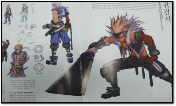
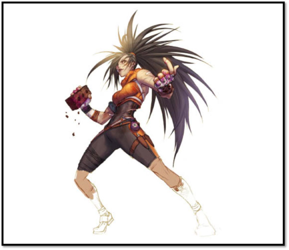
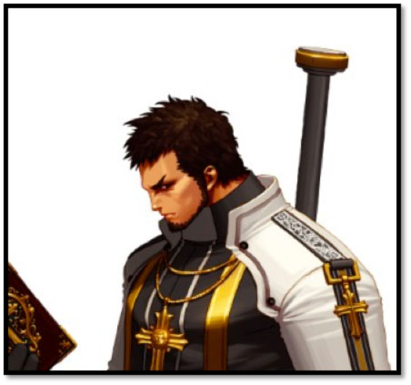
Consider, as one example, the “Ghost Knight” (鬼剑士) character’s onscreen look…
(These images captured from the game, with backgrounds removed to give a general idea of the character detail level. No other adjustments were made)


(Selection of a screen capture to show action style and general online game quality.)
…and art book reference:
As you can see from example above, in doing comparison for each class, sub-class and character, we found in each case: 1) there are several interpretations of the character’s clothing, facial expression, demeanor, hair, equipment and so on, as well as 2) several drawing and painting styles to choose from. Based on the assurances received, we interpreted this according to the freedom of interpretation agreed (and standard to the creative process), and so put aside our doubts and began character design.
To give you more context about why this seemed acceptable at the time, within the given reference book there are pictures of all sorts, none of which was specifically “affirmed or denied.” They all fit in with “following the art book,” for a look into “Kore-o-Japanese style,” so we carefully considered them all before going forward. To get an idea for the breadth of material in the benchmark provided, take a few examples: again, all from the book provided as our sole reference point…
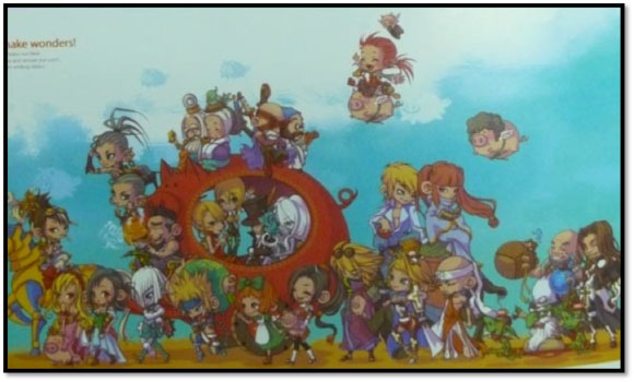

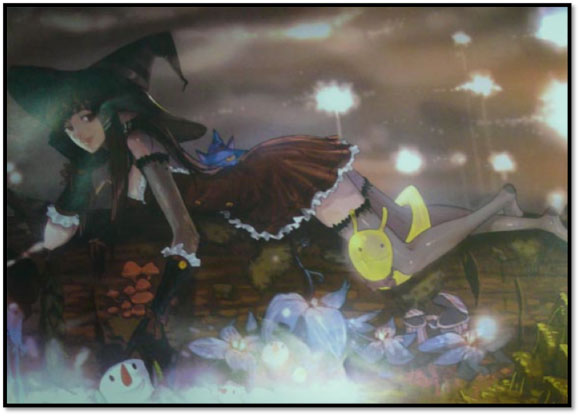
And for more examples, you can view this clip featuring ‘original pictures,’ from the book and otherwise published by the licensors.
To be clear, the art is all high-quality, to be sure. However, that is not the point. When creating a licensed product, and told to use these things as reference… one has to take these as guidance. So, ask yourself: what would you draw with such a set of materials?
Be that as it may, we quickly discovered that not all classes, subclasses or characters were covered equally. In many cases, the reference was incomplete, for example the painting was only partially finished. Again, this seemed to confirm our ability to interpret, according to the assurances and the standard process.
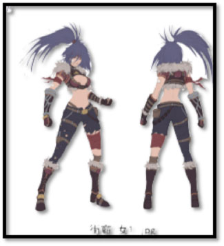
Take for another example, the Street Brawler class/characters:


(These images are captured from the game, with one background removed to show off the general character detail level. No other adjustments were made.)
Clearly from the on-screen characters there were several choices for clothing and it’s obvious that the book benchmark is not finished. We held our doubts in check. After all, we felt we had understood the character’s boundaries of clothing, equipment, actions, and so forth, we proceeded and designed one of the heroes as a Brawler, and duly submitted it for approval.
It was accepted, so we felt confirmed. Doubts were fully set aside – it seemed that the standard process was going to be followed, and our understanding of interpretive freedom was correct. All seemed well. So, in June, 2012 we kicked off full production of the illustrations and targeted our launch date for September, 2012.
Lesson Two: You can never be too sure, always doubt.
After spending May and some of June, 2012 working to generate the character designs needed, we invested another month to create the first batch of finished artwork (i.e. over 200 man-hours for the character designs, then over 800 man-hours to create first batch of “final” artwork).
Which was rejected.
Reasons for rejection included: not being Kore-o-Japanese enough, and stylistically the artwork did not look “DNF.” Reportedly it looked like other, competitors’ games. Additionally, the character was not correct, whether in coloring, equipment, hairstyle or expression.
The specific weaknesses of the critique seem pretty obvious to me, but it is probably worth taking a moment to point out several aspects. To repeat: based on “just follow the art book” reference and artwork, plus the in-game, on-screen versions, we had plenty of reason to expect room for interpretation. Even so, we did not stray far. For example, you can plainly see that the hair of the example Brawler character is spiky and flowing, which we followed in the approved character design and the illustration submission. Likewise, the character has pouches for poison and knives on her belts, which we followed even as we interpreted the poison itself as being in glass bottles, which seemed allowed, based on other in-book references (i.e. there is no specific guidance on where the poison comes from when characters throw it during the online game or in the book). Also, the clothing materials of cloth, leather and fur seemed clearly allowed in the in-book and in-game reference available. And so on.
With so many similarities between the reference material, our approved character design submission and the (rejected) illustration, we felt the rules of the game had changed. So, we traveled to TenCent HQ for a powwow.
Lesson Three: Talk is cheap.
During the meeting we displayed and reviewed finished illustrations. Only two were approved, and only “under duress.” As for the rest, the TenCent team insisted that the illustrations were simply not similar enough to the DNF brand, nor had we understood the classes or characters. However, we received no further benchmark materials, nor specific guidance on what exactly made this look “not DNF.”
Still, the two approved “under duress” were given a provisional OK if only we would change the color of the clothing. In retrospect, this was a huge warning sign that we should have paid closer attention to.
Be that as it may, we put our doubts aside again, reworked and resubmitted the begrudgingly accepted illustration.
It was rejected again.
Lesson Four: Start by getting your own house in order.
At this time, we realized that either the rules of the game were rigged or we had gotten them terribly wrong. Since we could not directly confront rigged rules, we decided to start with ourselves. We dropped the September, 2012 deadline and re-forecast for December.
Firstly, we decided our process was actually correct. How could it be wrong? It had been proven with bigger brands and more demanding products. So, secondly, we closely examined our understanding of the art style. We began to realize that the TenCent team had not fully understood what we meant by “WoW Model” and was in fact applying very strict, if currently incomprehensible, rules in approving the illustrations.
Therefore, according to standard professional process, we again approached them and asked for better reference. They provided a set of PSD files, now saying “Just abide by these ‘original pictures’ and I’m sure you’ll get approved.” These ‘original pictures’ were of the classes and some sub-classes shown in the book. For just a couple examples, you can refer to the Brawler example above and the Fighter example below.
Having this new benchmark in hand, we realized a few things. Firstly, we had to heavily discount the art book as a style guide. The earlier reassurances were empty; that book was not actually any benchmark at all, and had actually led us far astray. We had learned the hard way that there was no illustration leeway to adjust clothing, equipment, hairstyle, coloring or even painting style.
Lesson Five: When starting again, do your best to forgive and forget.
In fact, our art director at the time had a very tough time with this change and restart. He could not let it go. Through this time, and with a few related incidents with our illustration partners, we realized that the art director was part of the problem. Sadly, he was willfully not taking the updated material into new art direction, instead insisting the original direction was allowable. So, we had to let him go and get a new one, otherwise risk never getting anything approved.
Our new art director came on board in August, 2012 and quickly addressed the problems of understanding around the reference and benchmarks in the ‘original art.’ In a face-to-face meeting, he directly confirmed what our counterparts meant by Kore-o-Japanese style and went over the ‘original pictures’ one by one. At this point, we had zero pictures approved. We realized we also had to find new illustration partners.
This was less because the partners at the time were not capable, and more because we realized that in fact we were creating the style guide. And being forced to do it in the worst way possible: iterating it, while also hoping to get to market soon. Far from following the standard professional process, at this point we realized we were in the wilderness being forced to create something by guessing what the licensor wanted. To have even a slim chance, we had to ensure that our partners were nearby and ready to go through under the millstone with us.
Lesson 5.5 When starting again, it helps if your team comes with a network. (Especially in China.)
Thankfully, our new art director could call in some favors and we found a few studios willing to tackle this “standards” challenge along side us. At the same time, we threw out the character designs that had been approved earlier. Even though they had been approved, talk was indeed cheap – the illustrations based on those designs were not being approved now.
While it may seem incredible, yes – it is simply the case that the character designs were approved, yet not a single final illustration based on them was being fully endorsed or approved. The feedback was not direct, as is sometimes the case in Asia, but the conclusion was clear enough: we had to start over.
Ultimately, we began a pragmatic approach. Li Gang, our new art director decided that in the absence of a true style guide, we should first focus on the heroes in our game that had the most benchmark reference. In this way, we could establish the boundaries of the style and steer as close as possible to a standard creative process. Second, we expected that we would earn confidence from our partners and soon could further negotiate the standards of the TCG product. Lastly, we welcomed TenCent into the creative process and allowed them to comment on each stage during drawing – despite the time and trouble we knew it would add to our production process. We hoped all of this would make for easier approval and completion.
So, we again set to work creating illustrations, this time with approximately 10 studios and 40 artists. At first, the progress seemed to be reasonable. We submitted the sketches, then the early colors, then final illustrations. TenCent seemed more pleased and relaxed throughout. Corrections along the way at this early re-start stage were manageable. So, by mid-October, 2012 we felt we had realigned properly and that we could see a path to getting the product out the door.
Lesson Six: Just because you start over, doesn’t mean anyone else did.
Then the feedback from the ultimate licensor, Nexon/Neopeople started coming in. As a reminder: our license is a sub-license from TenCent, the operator of the game and overall property manager in China. Our agreement with TenCent does not mention any approval process that would include Nexon/Neopeople, and our requests to hold a three-way meeting to clarify standards and process was rebuffed by TenCent. Be that as it may, it was increasingly clear that TenCent was approving our images, then submitting them to Nexon/Neopeople for further comment and requiring New Edge (us) to make further changes based on those further comments.
At first, the Nexon/Neopeople input was manageable, but seemingly nitpicky in the obvious absence of a clear benchmark. For example, we were told that the character’s gloves were not right. Or a hair was out of place. Or the clothing was incorrect. Given what we had learned so far about disregard for a standard professional process, and the continued absence of robust guidance, we saw this as a huge warning sign.
Still, we clung to the proven process as a way to save the product and again started by examining our own understanding. That was when we realized there was going to be big trouble ahead.
Our new art director took the time to research a large selection of other DNF licensed material out there – things released by Nexon/Neopeople in posters, advertisements, other products and so on. We discovered that the style was even messier than we had imagined.
Consider the Fighter class/character and these example images released (or at least apparently approved) by Nexon/Neopeople, found around the web:


Aside from the very obvious differences in painting style and in some cases clothing, can you find even one instance where the gloves are the same? And yet, our characters were being rejected for things like “gloves are wrong.”
At the same time, even the direction of the ‘original pictures’ provided was not entirely clear. For example, they had several layers each indicating different clothing approaches and hinting at different painting styles:

So, when you’re told that your pieces are wrong, yet are not told what is right… what can you do? We had little choice but keep iterating in the hopes that we would luck into an approval.
Eventually, the huge warning signs started blinking and directed our attention to an even more fundamental problem. Among all the feedback, the most common refrain was “they are too different.” And when asked “different from what?” we were told finally told “from each other.”
As a reminder, this is a problem because our game is designed to have individual heroes, each with individual names and attributes. However, with this final revelation, it became clear that all along TenCent and Nexon/Neopeople seem to have thought all the heroes were just… the same.
Therefore, every single fighter hero and every single gunslinger hero and every single priest hero and so on… would all look like clones. Imagine a set of cards, each one representing a different hero: say Sally, Mary and Betty. Each one is a fighter, with different abilities and stats. Yet, they all look exactly alike. They all look like the left hand (‘standard’) version of the Fighter above – down to and including the facial expression!
This goes so far beyond any standard professional process and is ridiculous on so many different levels it’s hard to fathom. Still, a few basics. Firstly, the online game allows customization of player’s characters so that, while they look similar there are obvious distinctions. In fact, one of the reasons the game is popular and profitable is that players buy these distinctions! Second, any character that has its own name should have its own look, no? Can you imagine a game world where everyone who was a fighter looked like every other fighter? This goes double for a TCG where the individual cards are potential collectors’ items and the uniqueness of the art make each card more valuable. And even if you reject all of that, please consider: down to and including facial expression?! As if any human, at any moment… whether being healed or hurt, winning or losing… has the same facial expression!
Lesson Seven: When in doubt, insist!
At this point in November, 2012 we had already pulled off a minor miracle, re-starting and re-creating more than 200 illustrations with input and approval at each step from TenCent in only about six weeks. When added to the earlier, totally mis-targeted (read: failed) attempts, New Edge had spent at least five months (and exceeding 20,000 man/hours), yet had only approximately 15 illustrations approved. Our December, 2012 deadline was being pushed back, and we were wondering if even January, 2013 was going to be possible.
We had no choice but to return to our earlier fear: the rules of the game were changed again – or rigged – despite the several confirmations and ongoing assurances from our TenCent licensors.
So, after again reviewing our own internal process and measuring them against the well-known and standard professional practices (which we still cling to!), and re-checking that we hadn’t overlooked, misinterpreted or misunderstood reference or direction received, we began questioning the feedback and insisting on changes.
In a face-to-face meeting we pointed out how we had never been provided with a clear standard, as evidenced:
- By it being changed at least once already (i.e. from art book to ‘original pictures,’
- The current materials were at best incomplete and at worst completely misleading,
- We were circling towards approvals by submitting, correcting, re-submitting, re-correcting… until no one could think of anything more to say, which was so far vanishingly rare and,
- The quality of the feedback was either a frighteningly vague ‘not similar enough’ or a completely nitpicky ‘the hair is out of place’ or a combination like ‘the facial expression is not supposed to be like that.’
- Allow me to continue giving further context and details. As a simple example, much of the reference material shows only a character in profile (the face, just from the side), or only has a view of the front. Many of our illustrations are from other orientations: front-on, showing the back and so on. So, when we get “not similar enough,” to the “original picture” (which is incomplete and only from one perspective): what does that imply? That our illustration must be profile? Or perhaps some specific of the illustration must be changed? If so, what? The clothing? The equipment? Going further, when the face is “not similar enough,” what about the face should be changed? The expression? And if so, what about it? More angry? More happy? Hurt? In the lips? The eyebrows? (See example below for more.)
- At a minimum we expected more benchmark material, for example showing the character from different angles (which is a standard of any style guide!). Or, with such nitpicking, it would have been more direct and efficient to point out exactly what was needed. “Not similar enough” simply leaves the entire set of “corrections” open to interpretation, which means the illustration will only be “correct” after we invest more rounds of painting until the people behind the curtain say “I like this” and approve it.
We also pointed out that the TenCent and Nexon/Neopeople teams seem to have completely misunderstood or ignored our input, most importantly on heroes. There is just no way to have them all be clones and still have a truly viable and attractive product. Too much of the flavor is lost!
Indeed, we furthermore asserted that without any improvement in the situation, we would have no choice but to give up. You just can’t make a card game this way.
Lesson Eight: Talk is indeed very, very cheap.
In our discussions in November, 2012 our counterparts at TenCent seemed to get the point. We were promised that the images would be approved within a week, and that a solution for the hero problem would be presented after an immediate consultation with the TenCent executive producer and Nexon/Neopeople.
The week-long deadline passed, and we got another round of correction requests, from Nexon/Neopeople via TenCent, which is perhaps best exampled with this one…
Our solution? We 1) simply took the face of the “original picture” and grafted it onto our illustration and 2) slightly altered the face of ours to look further askance (i.e. the pupil/iris further moved so that he’s looking further to the left). Both versions were then approved.
Ultimately, in late November we had only 78 of 220+ images approved. This was enough for us to finalize the Starter Packs. And we had reached this point only after the licensors were missing their own self-imposed deadlines, after which we received no further input… except that we were asked to re-submit the so-far-unapproved images at “actual card size,” and in their card frames. That is to say, Nexon/Neopeople and TenCent would ignore all our earlier submissions and would take no further action until we re-formatted our A4 size illustrations to a 63mm X 88mm size, because this “would help speed up the approval process” according to TenCent.
This time we were very sure the rules had changed and that things had gotten way, way out of control.
Lesson Nine: Enough is enough.
When you act in good faith, investing blood, sweat and capital into creating something, you expect the same from the other side. In our case, we recognized our own failings and corrected them during the summer. We went on to strictly control a process involving over 10 studios and over 30 artists to create art that far surpassed the public benchmarks (examples above) and did our best to follow what little direction we received. We asked only what was granted in the agreement: the right to create and sell a TCG based on the DNF license.
However, we received no such courtesy in return. As of early December, we still had only approximately one-third of our illustrations officially approved. When would the others be ready?
We couldn’t wait. We went to press. After all, TenCent, our licensor had already approved all the images. It may be using a gray area, but the fact is that Nexon/Neople are not approvers in our contract. We were going through this process as a courtesy. And as the clock ran out for New Edge, that had to become TenCent’s problem. We had to hand the files to the printer and start manufacturing the product.
As if to underscore the ridiculousness, three weeks after the launch of our Starter product and one week before the release of Boosters, we finally received word via TenCent. This timing is critical. If had we actually waited for that final word, the product would have launch in April, not December. Remember that we had already moved the launch back three months, and had we waited it would have been six. Outrageous, and as I’ve mentioned: we couldn’t accept it and had to go to print.
The story continues, of course, and I will try to provide updates as it continues to unfold. Still, at this point we can wrap up most of the lessons and try to list out the takeaways.
In the end, we took an extraordinary move and went to print. We were ready to entirely cancel the partnership. The road we’d been forced down was a dead end, so we simply had to plow forward. How could this situation have been avoided?
- Get creative guidance from the people who will say “OK” (or not) to your work. You must have a standard, even if you have to create it for yourself.
- If you have doubts, stick to them. Those niggling thoughts will almost certainly grow until they are big enough to bite, and hard.
- Be sure you know your own process and how things have been done, including the specific reasons why approvals are not being given. This is the only way to be sure the problem is not with you and provide yourself ammunition for negotiations.
- If you do a reset, be willing to reset all the way to zero. It may be necessary to change members of your team.
- Don’t listen to reassurances; get the guidance and information you need. Otherwise you risk falling into an iterative black hole.
- When you are sure you’ve done everything you can to correct the situation, take action accordingly.
“Taking action accordingly” is a judgment call. A small company like New Edge cannot hope to take on a company likes TenCent, even in circumstances as ridiculously afar from professional process as these. We chose to go after a licensed product, and therefore tied ourselves to the proverbial three-hundred pound gorilla, no matter where he fumbled along and flung us.
We did our best to cleave to a proven process. And nevertheless got taken for a ride that has cost us capital, the morale of our team and even burned out some of our partners as we were all heavily ground under the iterative guessing millstone. The ripples from these delays continue to haunt us as we attempt to catch up on marketing and other activities.
Looking forward, we also must risk further trouble because the situation is not entirely resolved. Even in recent meetings, we continue to receive input that all the heroes should be “more similar.”
We regret having to take the gamble and going to market, but it is equally clear that we had to take the only chance available. Of course, only New Edge worries about any of these problems because we are the only ones on the hook. We’ve been the only ones on it since we hoisted ourselves on this petard.
Once we started, we were never in a position to say ‘no.’ So, we should have started with “No, we won’t even start without proper guidance.”
We should have listened to those doubts.